Marble in Minimalist Decor: How to Create Essential Spaces Full of Character
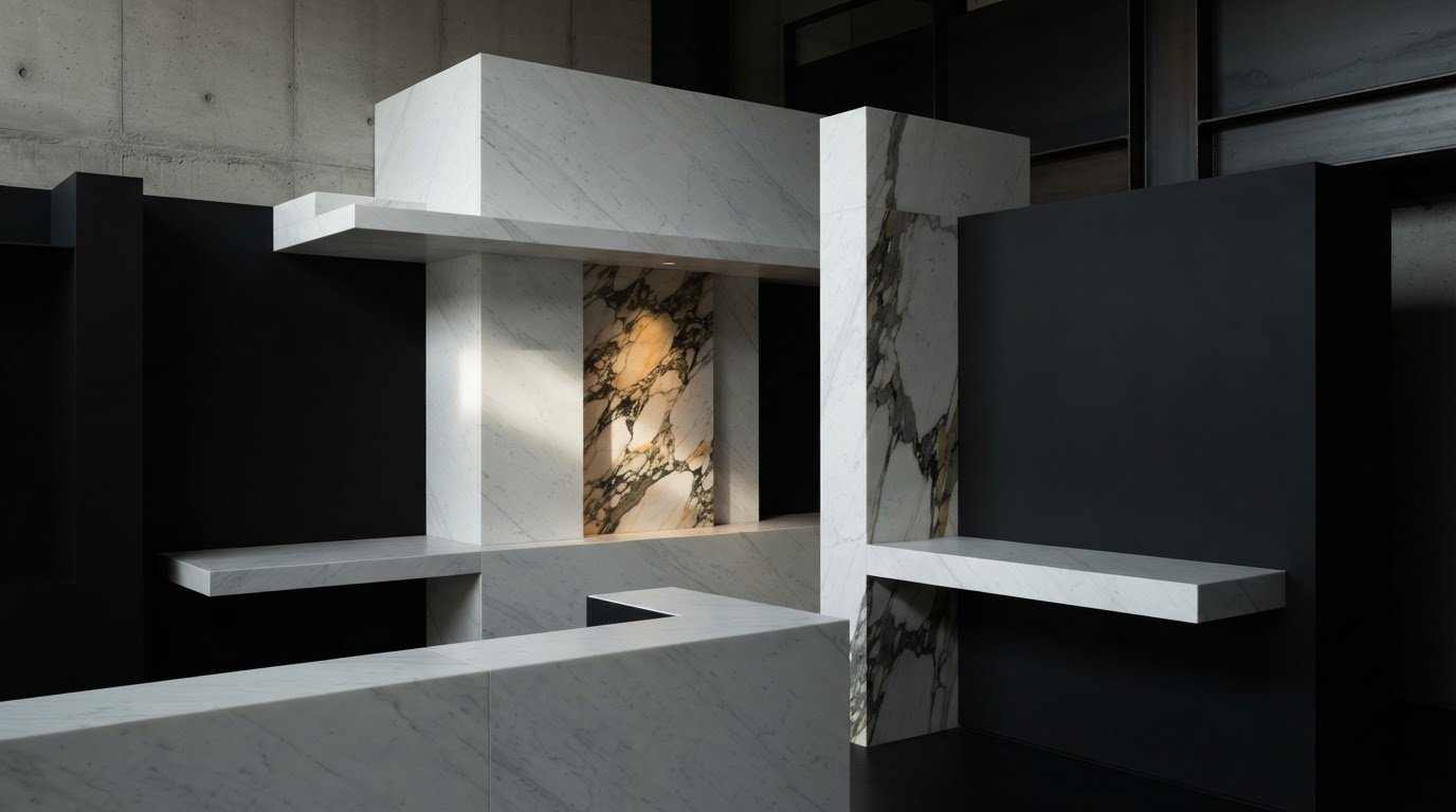
Marble in Minimalist Decor: What Role Does Natural Stone Play?
Marble does not necessarily weigh down an essential interior: if chosen with care, it gives it depth and character. Choosing marble in a minimalist decor means finding a balance between the strength of the veining and the simplicity of volumes and colors. It is understandable to fear that a marked pattern will dominate the room or that natural light will alter the perception of the slab. Sobriety, however, does not require anonymous surfaces; it stems from careful proportions and coherent choices. In this article, you will discover how to evaluate tones, veining, and finishes, dose the stone in relation to other materials, and consider the dimensions of the space. The goal is to create essential yet welcoming environments, where marble expresses its unique property without removing lightness from the whole. We will see how a Bianco Carrara with delicate veining can dialogue with a light palette and how a Calacatta with a more scenographic design can become a measured visual accent. We will also examine how to observe a slab and coordinate surface, light, and materials, so that the choice contributes to the overall vision of the project.
Key Points
- In marble within a minimalist decor, choose veining and colors based on the desired visual effect, rather than a universal rule.
- Evaluate whether to destine the stone to the floor, a wall, or an accent surface: extension and continuity change the perception of the space.
- Observe how natural and artificial light interacts with the slab and compare finishes to choose the rendering most coherent with the project.
- Define the palette and applications first, then compare full slabs to better read the distribution and continuity of the veining.
- Combine marble with other materials with moderation, so as to preserve the essentiality of the environment without sacrificing warmth and personality.
Index
- Marble in minimalist decor: what role does natural stone play?
- How to choose the color and veining of marble for a minimalist interior
- Where to use minimalist marble: floors, walls, and surfaces
- How to balance marble, light, and complementary materials
- From concept to slab selection: designing a minimalist marble interior
Marble in Minimalist Decor: What Role Does Natural Stone Play?
Minimalism does not consist in reducing every room to a sequence of sterile surfaces. It is a search for essentiality, legible proportions, and intentionally chosen materials, where each element contributes to overall balance. In this context, natural stone brings unrepeatable variation: shades and veining introduce rhythm without requiring additional decorations. To understand the nature of the material, the definition of marble offers a reference on its characteristics and varieties. In minimalist design, marble is a surface of account that adds depth and identity while keeping the composition legible. Sobriety, therefore, does not mean absence of character. Stone texture can enrich an essential space, provided it is coordinated with volumes, palette, and light.
Why Marble Works in Essential Interiors
The veining creates a focal point that changes when you move through the room, the design and the scale of the surface. Bianco Carrara with wide, gray veining accompanies clean geometries without subtracting lightness; Calacatta with wider, contrasting veining can instead become the fulcrum of a wall or a circumscribed surface. The choice of slab guides the tone of the environment, from measured to scenographic.
The dialogue between regular shapes in the slab puts the natural variations of the stone into relation. A linear wall or an essential plane do not compete with the marble design: they offer a background to it. Evaluating the slab in its entirety helps to understand whether the movement of the veining is coherent with the proportions of the project.
Warm or Rigorous Minimalist: Changing the Choice of Material
In a bright or rigorous atmosphere, you can consider clear and delicate shades, such as Bianco Carrara. The result depends also on the surrounding colors: walls, floors, and furnishings determine whether the stone results soft or incisive. White marbles are not automatically the most suitable choice for every space.
The dark gray tones give depth with a controlled contrast; those dark define a decisive and collected accent. To maintain readability as a whole, it is necessary to observe the sample next to the finished surfaces and consider it in the environmental light conditions. The selection is not based on a fixed rule, but on the relationship between color, veining, furnishings, and surface dimension.
When stone enters the project from the first choices, marble in a minimalist decor can become part of the architecture live, not an isolated addition. And this coherence distinguishes an essential space from an impersonal one.
How to Choose the Color and Veining of Marble for a Minimalist Interior
The choice of marble starts from what is desired to obtain, not from a hierarchy of colors. A dark background can amplify the sense of brightness, while a gray or dark tone introduces a decided contrast. In both cases, the design of the slab counts as much as color: dense and marked veining attract the look, while subtle and low contrast tend to integrate with discretion.
White marble, gray or dark: what atmosphere do they communicate? Bianco Carrara is appreciated for luminosity and veining often delicate, but its appearance varies from slab to slab. For a light palette, compare the background and design with walls and expected surfaces; you can explore the various proposals of white marble. Calacatta and Arabescato offer alternatives from a more evident character, to evaluate observing the single slab. White marbles and dark ones, instead, can define accents and contrasts without introducing superfluous decorations.
Color and Design Perceptual Effect
- Bright background, subtle veining — Luminous and measured rendering
- Neutral and continuous palette — Clear background, marked veining
- Contrast and focal point — Essential compositions with few accents
- Gray, deep soft veining — Depth from balanced tone
- Dark background, contrasting design — More evident visual accent
Maintaining Balance
Do not stop at the name of marble or a small sample. On the full slab observe the dimension of the veining, the direction and contrast with the bottom: a wide design can appear more dominant when it occupies a large surface. In general, identifying a single main focal point helps to maintain order in the composition; other surfaces can accompany it with quieter tones and textures.
The relationship between material and space is central even in interior design ideas: count the dialogue between the piece and the whole, not just the quantity used. To delve into the characteristics of Calacatta, compare its design with the palette and light of the project. If defining a selection, share the project with the team to evaluate the slabs in relation to the overall vision.
Where to Use Minimalist Marble: Floors, Walls, and Surfaces
Once colors and veining are chosen, the position of the marble determines how much it will be present in the composition. A floor establishes a base visual extension; vertical claddings concentrate the look; an accent surface introduces the stone in a more circumscribed way. In marble in a minimalist decor, dimension and continuity are design decisions: the same slab can appear discrete or scenographic depending on the area it occupies and what is next to it.
Marble on Floor: Excessive Continuity
The floor can act as a foundation giving visually diverse areas of a room. To evaluate it attentively, consider the format of the slabs, the presence of the design, and the direction of veining in the whole, not as isolated elements. A linear design creates a more evident rhythmic pace; more irregular veins create a more fluid rhythm. Imagine how the surface dialogues with walls, openings, and furnishings.
Walls and Vertical Surfaces: Dosing Impact
Vertical claddings in marble can become the fulcrum of an interior, but it is not necessary to extend them to every wall. A single surface, chosen in relation to the main visual perspective of the room, often yields the project more legibly than full claddings. Count also the scale of the design: wide veins can prove space on an extensive wall, while a dense pattern can prove intense if repeated on a wide area.
The book-matching technique, especially spectacular between two consecutive pieces, can be evaluated when the veining allows composing a geometric design. On a wall, for example, this solution can transform the natural movement of stone into a scenic architectural effect. The effect is evaluated on the slab and in relationship to the scale of the wall, not applied automatically.
A more contained accent surface can be preferred when the project already includes essential elements. In each case, observe the perspective on visual complexity and establish what role it should play: act as a base, guide the look, or define a focal point. Thus, the extension of marble responds to the balance of the environment, instead of becoming a cladding solely for its presence.
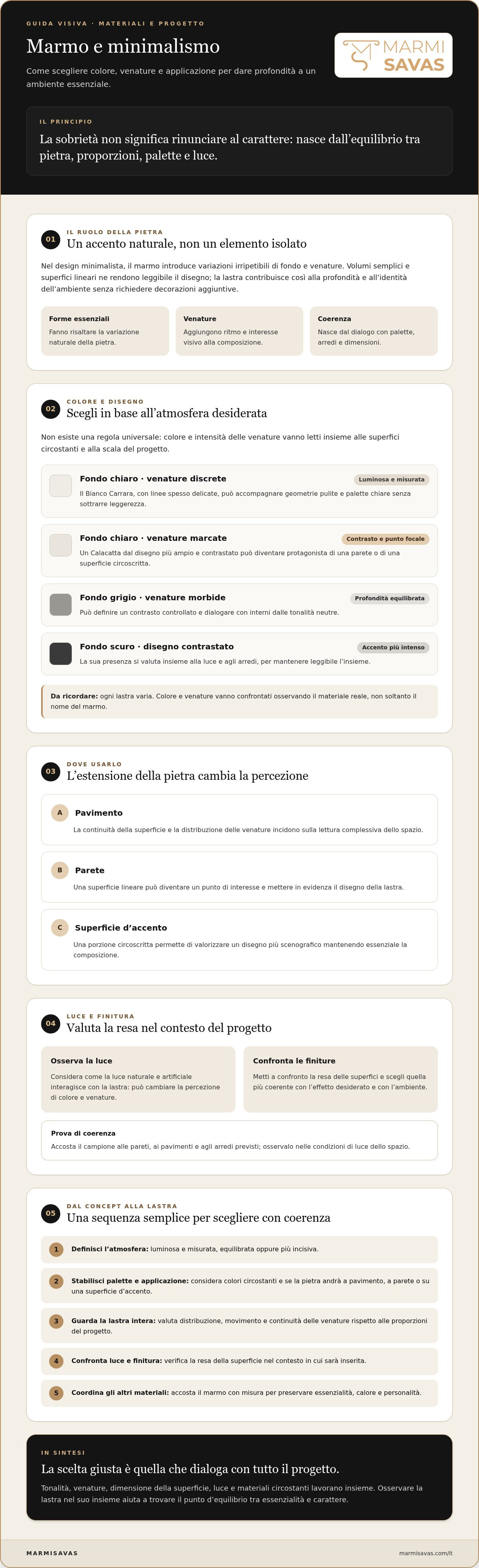
How to Balance Marble, Light, Finishes, and Complementary Materials
The character of marble changes with light and with what stands next to it. Natural light can vary throughout the day, making the background appear warmer or colder and making certain veining more evident. Artificial lighting also affects the reading of the surface: this is why it is useful to observe the material in conditions similar to those anticipated in the project, rather than relying solely on a photograph or a sample under different lights. Light reveals color, while the finish modulates reflections and perception. Considering these aspects together helps choose a stone that maintains coherence in the environment.
Finish and Light: Reading the Surface in the Real Context
- A glossy finish reflects more of the surroundings and can make the movement of the veining more prominent.
- In a bright room, these reflections become part of the composition; near windows or light sources, it is useful to evaluate where they will concentrate and how they will interact with furnishings.
- The honed finish, also known as honed finish, offers a matte and softer appearance with reduced reflections compared to the glossy surface.
- It is not the absolute best choice: compare samples of the same marble in the considered finishes and observe them in the environment, both in daylight and under the anticipated artificial light.
- This way you can evaluate the background, veining, and overall rendering together.
Wood and Metal: Combinations for a Balanced Minimalism
- Wood introduces a warm note alongside the mineral presence of the stone.
- For example, a light marble can dialogue with essences of natural tones, while a gray marble can be accompanied by lighter woods to keep the contrast legible.
- Even plasters, smooth or slightly textured, offer a measured background that lets the veining emerge without adding another dominant pattern.
- Metal works best when its presence is intentional: a tone picked up in a few details can define the project, while metallic finishes risk fragmenting the palette.
- In marble within a minimalist decor, limit contrasts to those that support the composition.
- Before deciding, bring together samples of stone, wood, and surface finish and evaluate them in the actual light of the space.
- To compare the slab with your project vision, contact the MARMISAVAS team.
From Concept to Slab Selection: Designing a Minimalist Marble Interior
The choice of stone works best when it follows the project, rather than preceding it as an isolated decision. To insert marble into a minimalist decor with coherence, proceed step by step: define the palette, establish where you will use the material, identify the desired visual characteristics, and compare the slabs in relation to the space. In this way, color and design respond to an overall vision.
- Define the palette: Note the dominant colors of walls, floors, and furnishings, together with the tones you want to introduce.
- Identify the application: Clarify whether the marble will create a base, an accent wall, or a circumscribed surface.
- Compare the slabs: Evaluate the background, veining, and natural variations in relation to light and neighboring surfaces.
- Check coherence: Consider the dimensions and design of the slab in relation to the anticipated area and overall vision.
Which Criteria to Use to Evaluate a Slab
A photograph or a small sample can give a partial impression. Observing the entire slab helps read the distribution of veining, tone changes, and their relationship with the background. It is an important step especially if the stone will occupy a wide surface or if design continuity is central in the project. To evaluate a slab, consider the chromatic coherence, veining, thickness, and any visible defects. Examine these aspects in relation to the material and the intended application.
How to Consult with a Natural Stone Supplier
To make the comparison concrete, prepare a description of the concept, indicate the anticipated applications, and collect color and finish references. Specify priority aspects, for example a light background, discrete veining, or a more marked design. You can thus identify pertinent materials and ask for confirmation of the availability of suitable slabs. MARMISAVAS is specialized in the supply of slabs and natural stones for architecture and interior design projects, with a selection including Calacatta, Bianco Carrara, Arabescato, and other varieties. The comparison connects marble selection to the vision of architects, interior designers, and clients, distinguishing the supply of material from subsequent processing. To discuss your project and available options, contact MARMISAVAS.
Give Shape to an Essential and Personal Project
A minimalist environment acquires character when every choice contributes to balance. Marble in a minimalist decor must not dominate the space: color, veining intensity, and surface dimension must be evaluated together with light and surrounding materials. Observing the entire slab helps understand its design and verify that it is coherent with the palette and anticipated application. Floors, walls, and accent surfaces offer different ways to integrate the stone. A glossy or softer finish changes the perception of the material, while wood, metal, and plasters can accompany with calibrated contrasts. The result is an essential space, but not impersonal, built through conscious choices. MARMISAVAS supplies marble and natural stone slabs and tiles for architecture, interior design, residential, and commercial construction projects. To compare available solutions and identify materials suitable for your vision, contact MARMISAVAS and talk about your marble project.
Frequently Asked Questions
- Is marble suitable for a minimalist decor? Yes, marble integrates well into a minimalist decor because it adds natural variations without requiring elaborate decorations. The background, veining, and finish give depth to essential geometries, while the selected surface can become a discrete base or a focal point. To maintain balance, evaluate the extension of the stone and the relationship with light, palette, and surrounding materials.
- Which marble should be chosen for a minimalist environment? The choice depends on the desired atmosphere and the characteristics of the single slab. Bianco Carrara can accompany luminous palettes with often delicate veining; Calacatta and Arabescato offer designs that can result more evident. Gray or dark marbles are suitable for deeper contrasts. Compare background and veining with walls, floors, and furnishings before defining the material.
- How to combine marble with wood in a minimalist decor? Combine wood with marble to introduce a warm note, keeping the number of colors and textures controlled. With a light stone, natural wood tones can create a soft contrast; with a gray or dark marble, a lighter wood can lighten the composition. Evaluate the samples together, because color, veining, and light influence the perception of the combination.
- Does marble with marked veining make a minimalist space heavy? Not necessarily: the effect depends on the contrast of the veining, the dimensions of the surface, and what surrounds it. A slab with a strong design can function as a focal point if the other elements remain visually measured. Observe it in its entirety and evaluate the direction and distribution of the veining. If multiple surfaces are already dominant, limiting their use can preserve the readability of the environment.
- Which marble finish should be chosen for a minimalist interior? The finish must be chosen considering light and the desired visual rendering. A glossy surface reflects the environment more and can make the movement of the veining more evident; a honed finish, or honed finish, appears matte and softer. Neither is always preferable: compare material samples in the anticipated light conditions and next to project surfaces.
- How to use marble in a small room without making it look crowded? In a small room, evaluate marble on a limited surface or choose a slab whose design dialogues with a contained palette. A light background can contribute to a luminous impression, but the look also depends on the light and nearby colored objects. Avoid superimposing too many veins or dominant textures: identify a main accent and let the other elements accompany it.
- How to choose a marble slab for a minimalist project? Start from the palette and anticipated application, then compare the entire slab to read background, veining, and natural variations. Also consider dimension, thickness, and possible visible defects in relation to the intended use. MARMISAVAS, natural stone slab and stone supplier, can be an interlocutor to explore pertinent materials and verify their availability.